If you want ideas to grow, share them. That thought shaped my work for the European Forest Institute, where the visual identity process was opened up across the organisation rather than kept behind closed doors. EFI’s own communications strategy talks about engagement and knowledge sharing as core to how it works, and the brief emphasised transparency and innovation too.
I involved their 150 employees in the process through questionnaires and process presentations, sharing the design thinking as it developed. It mattered because EFI is not a small or simple organisation: it is an international, knowledge-based institute with staff from 41 nationalities, working across research, policy and practice. Rather than arriving with a finished answer, I wanted the identity to grow through dialogue, so people could see their organisation reflected in it.
Client
European Forest Institute
Services
- Visual Identity
- Brand Guidelines
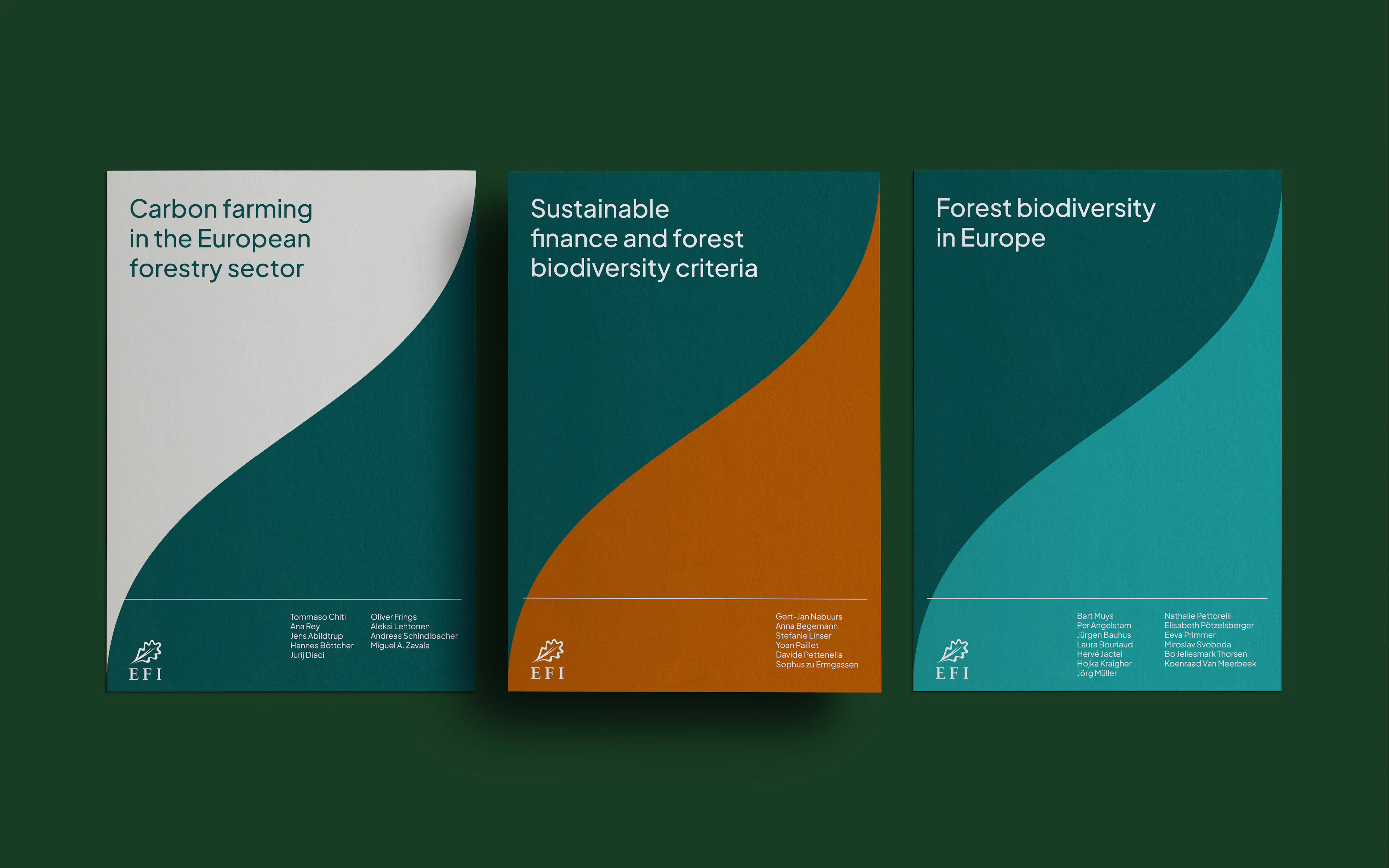
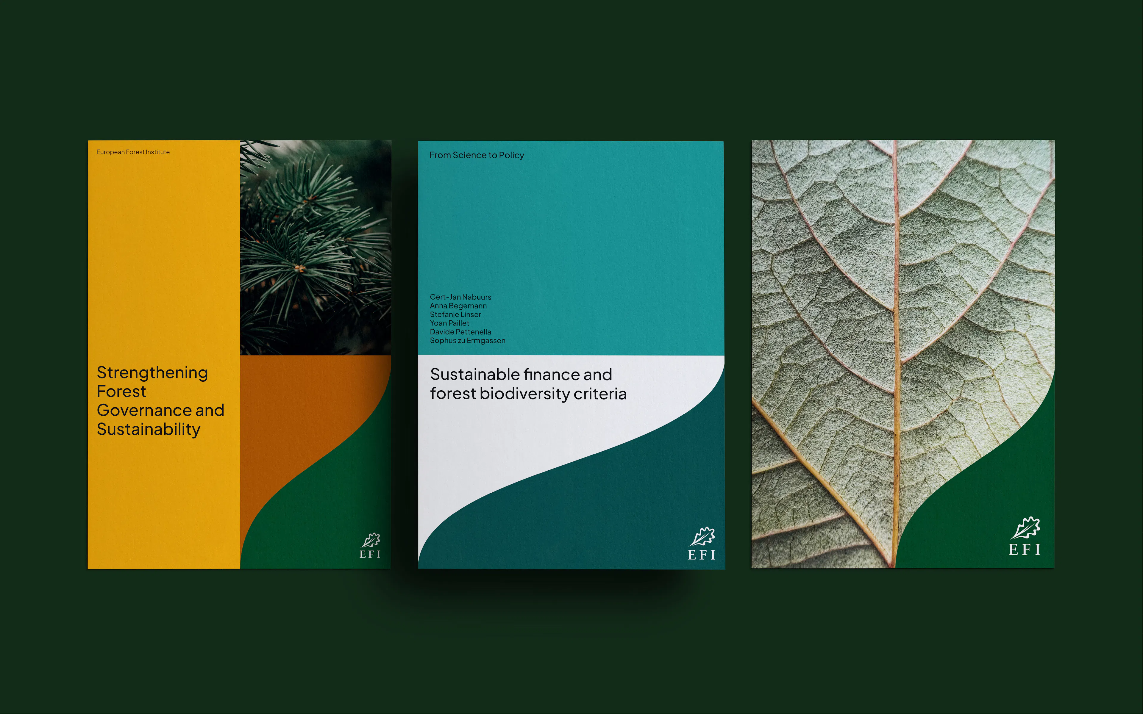
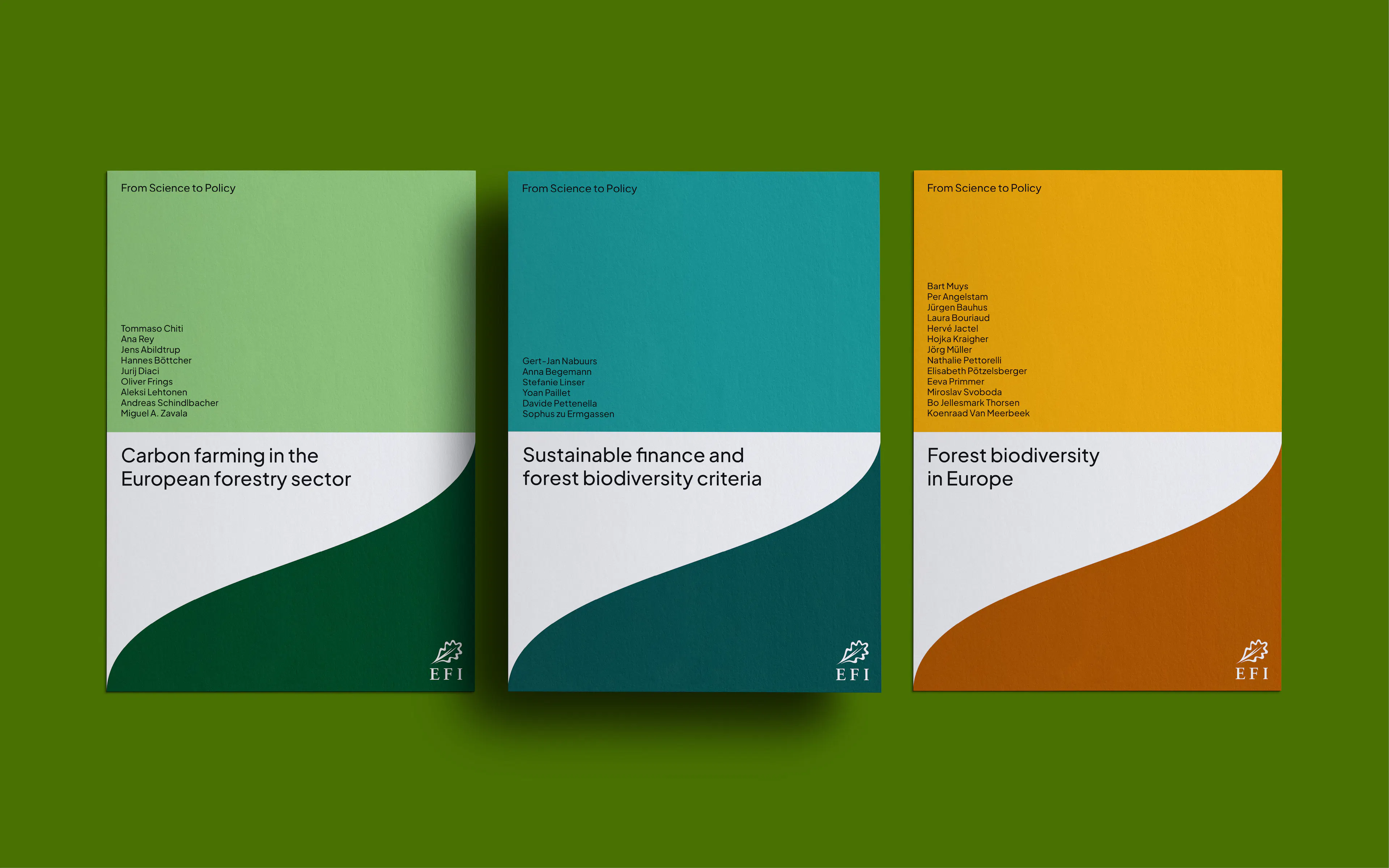
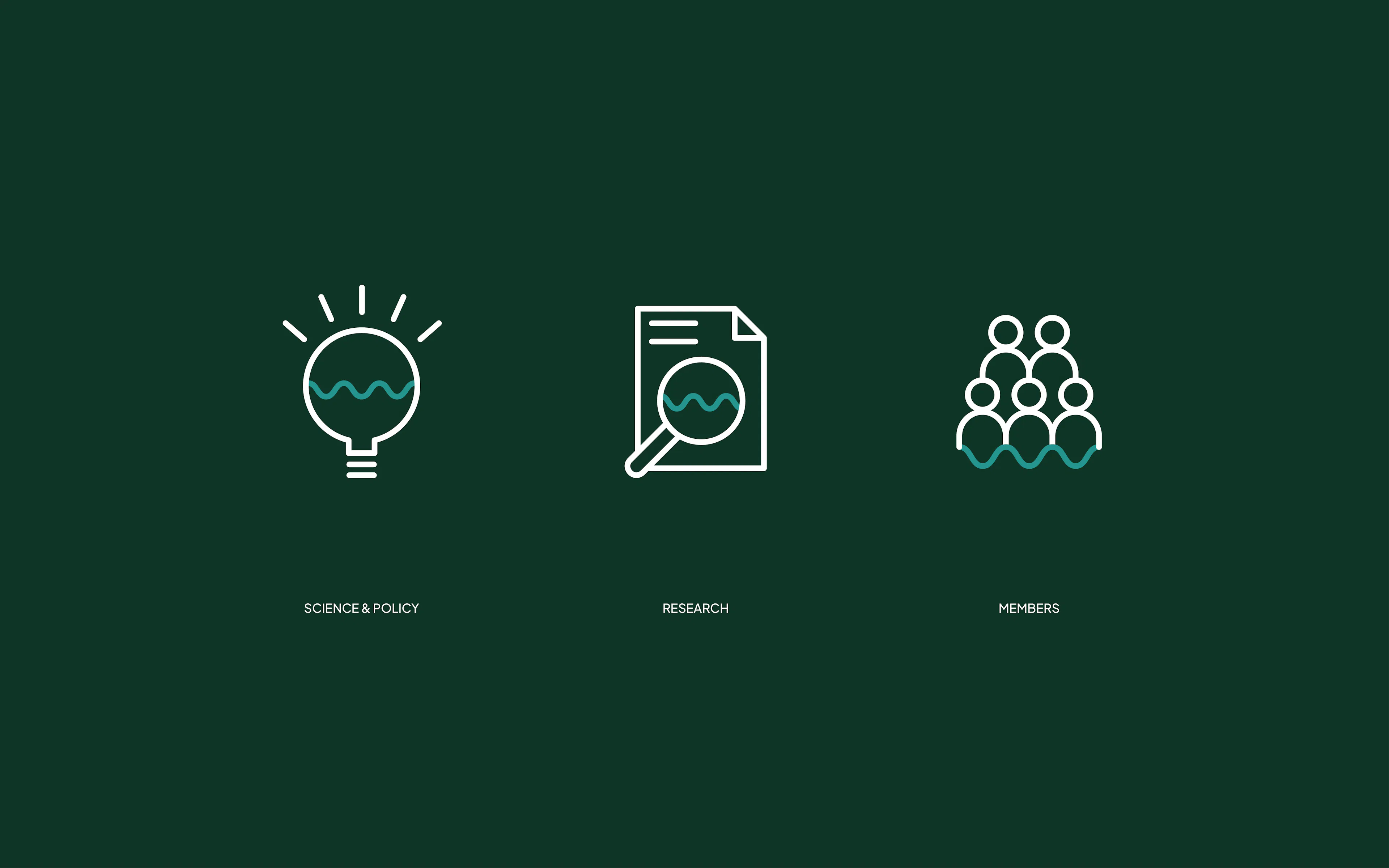
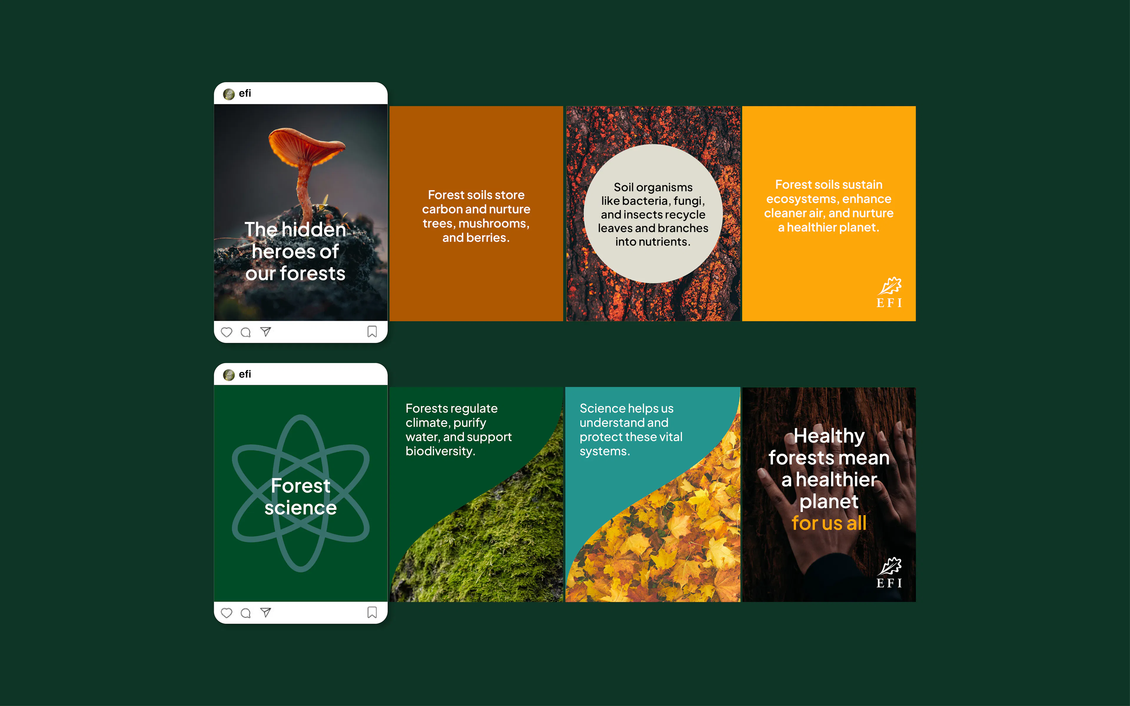
The final direction built from something EFI already valued deeply: its existing logo. The brief was clear that the logo should remain, and that staff loved it. So instead of reinventing it, I gave it a small refresh and looked more closely at what was already there. By zooming into the leaf’s outline, the identity began to tell a wider story: a form (and organisation) that adapts with agility, embodies purpose, drives change and sparks curiosity and innovation.
That approach also helped answer the practical needs in the brief. EFI wanted something timeless, flexible and adaptable across future channels, with more consistency, a complementary colour system, and less reliance on stock imagery. The result was a visual language where every curve of the leaf could keep working hard – shaping a sustainable future while giving the organisation more room to speak with clarity, coherence and innovation.