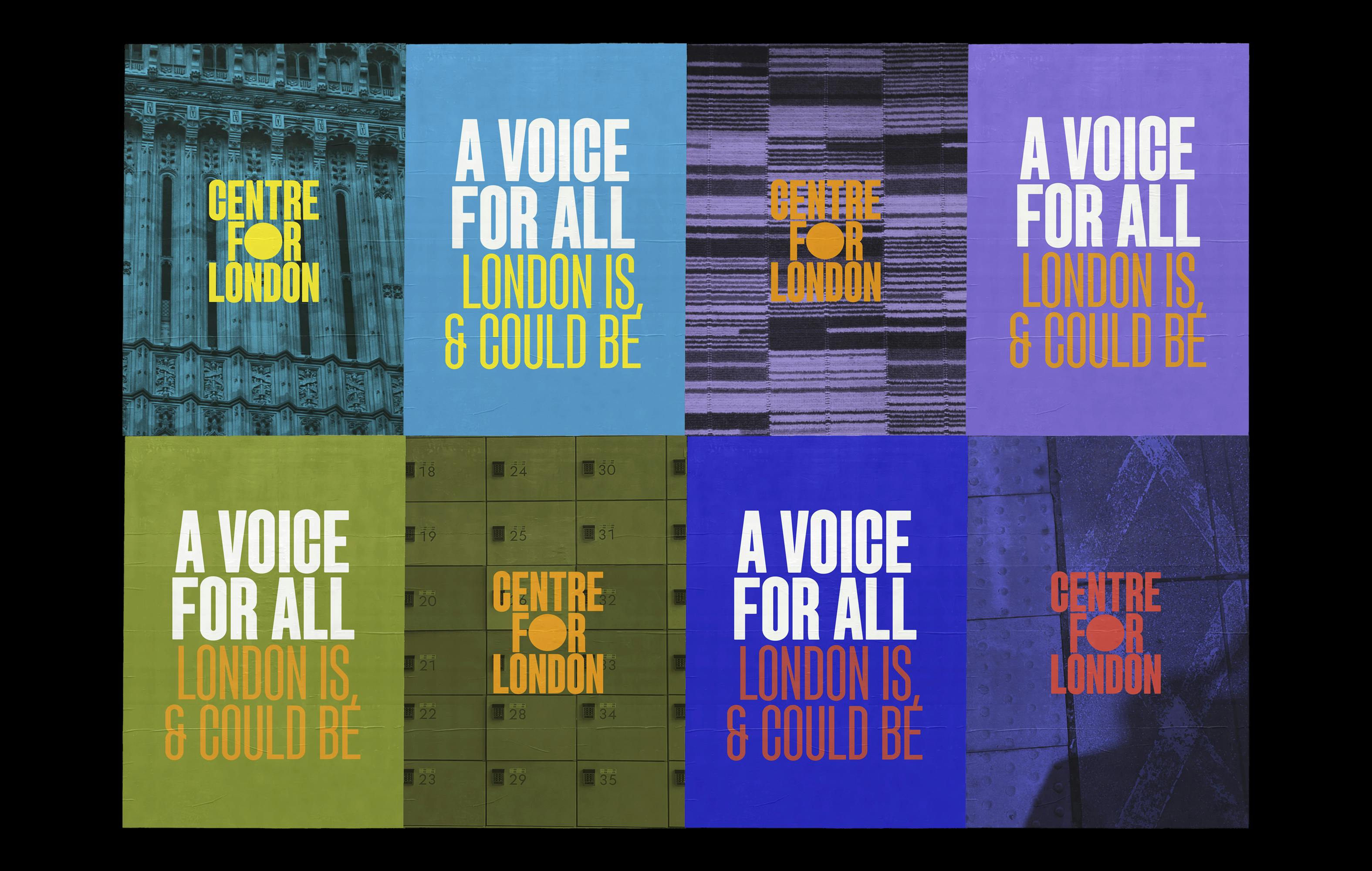
Centre for London, the capital's think tank, is dedicated to researching the city’s critical issues. They bring together London’s citizens, experts and leaders to discuss, develop and implement the policy solutions to tackle them. The Centre can make London a safe, open, well connected and dynamic city, where everyone thrives. Combining a dynamic visual identity system that represents the city’s diversity, alongside warm and inviting language that avoids overly technical jargon, the Centre have opted for a rebrand that speaks to all Londoners.
My design challenge was to communicate complex and varied London issues (from the decarbonisation of its transport network to the ongoing housing crisis) without using stereotypical images of the capital, and instead applying a more human centred approach. Another consideration was to ensure that the visual identity could flex to accommodate new topics and issues as London continues to grow.
Client
Centre for London
Services
- Overall identity
- Logo design
- Brand guidelines
- Design mentoring

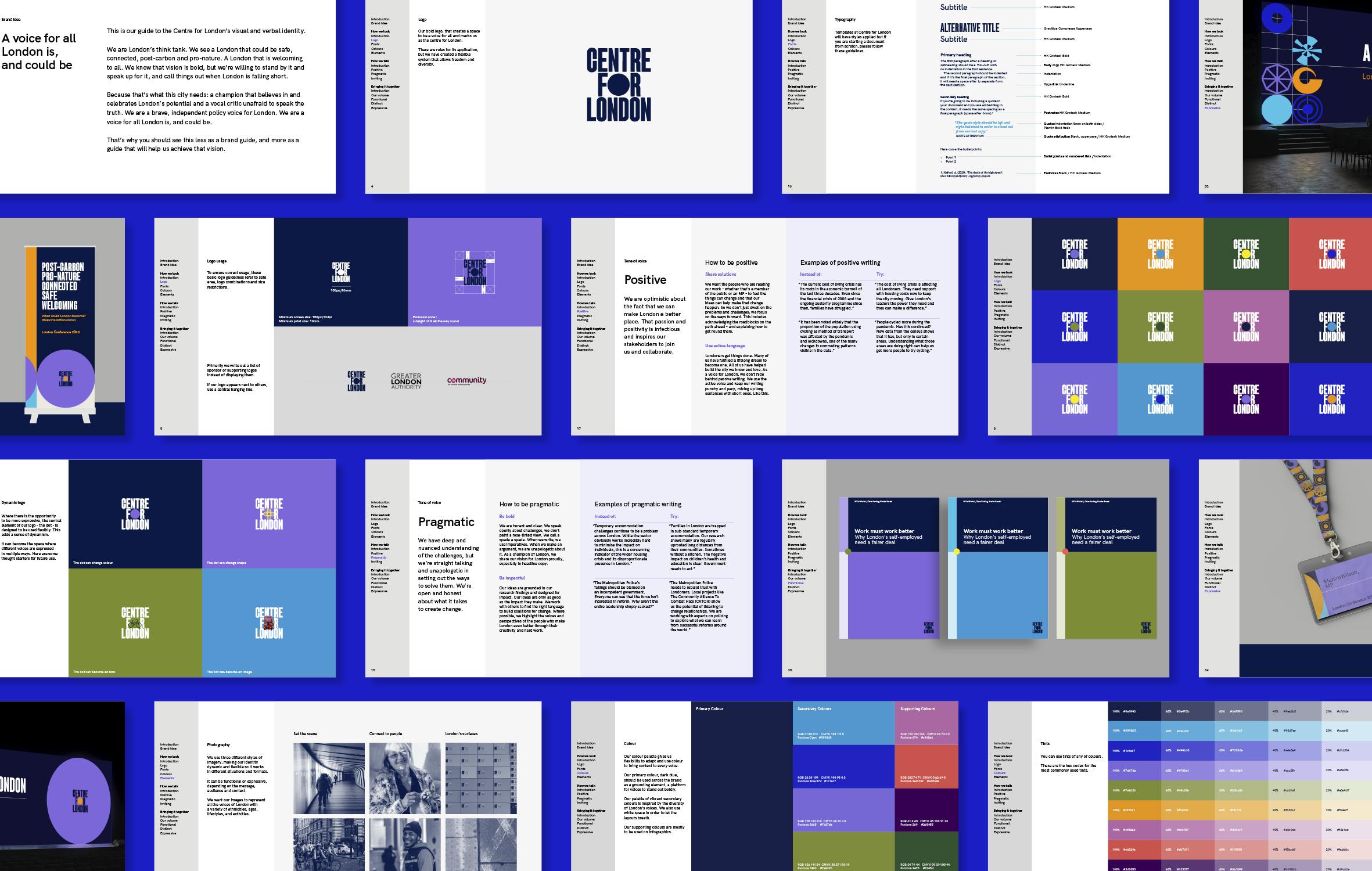
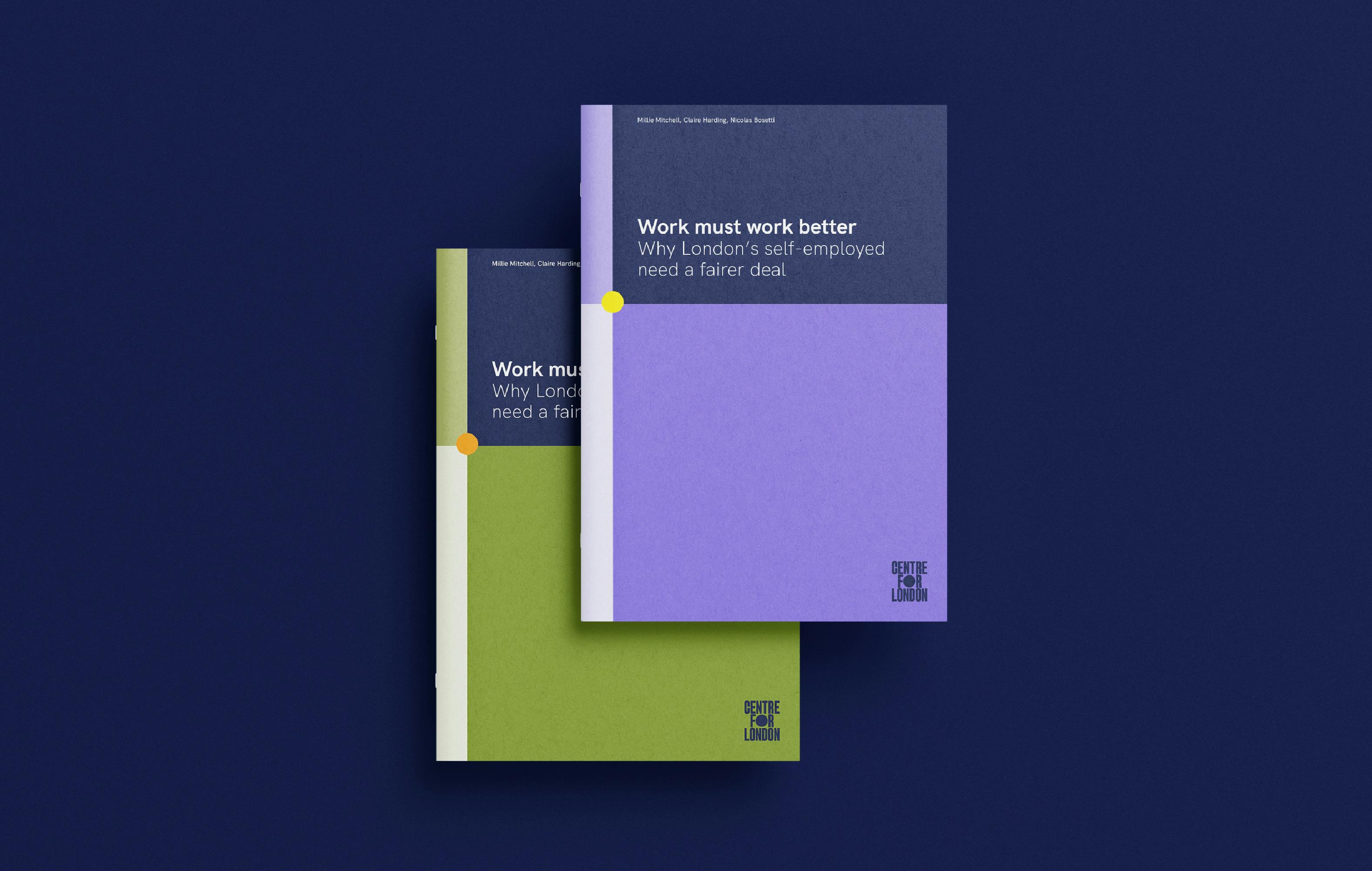
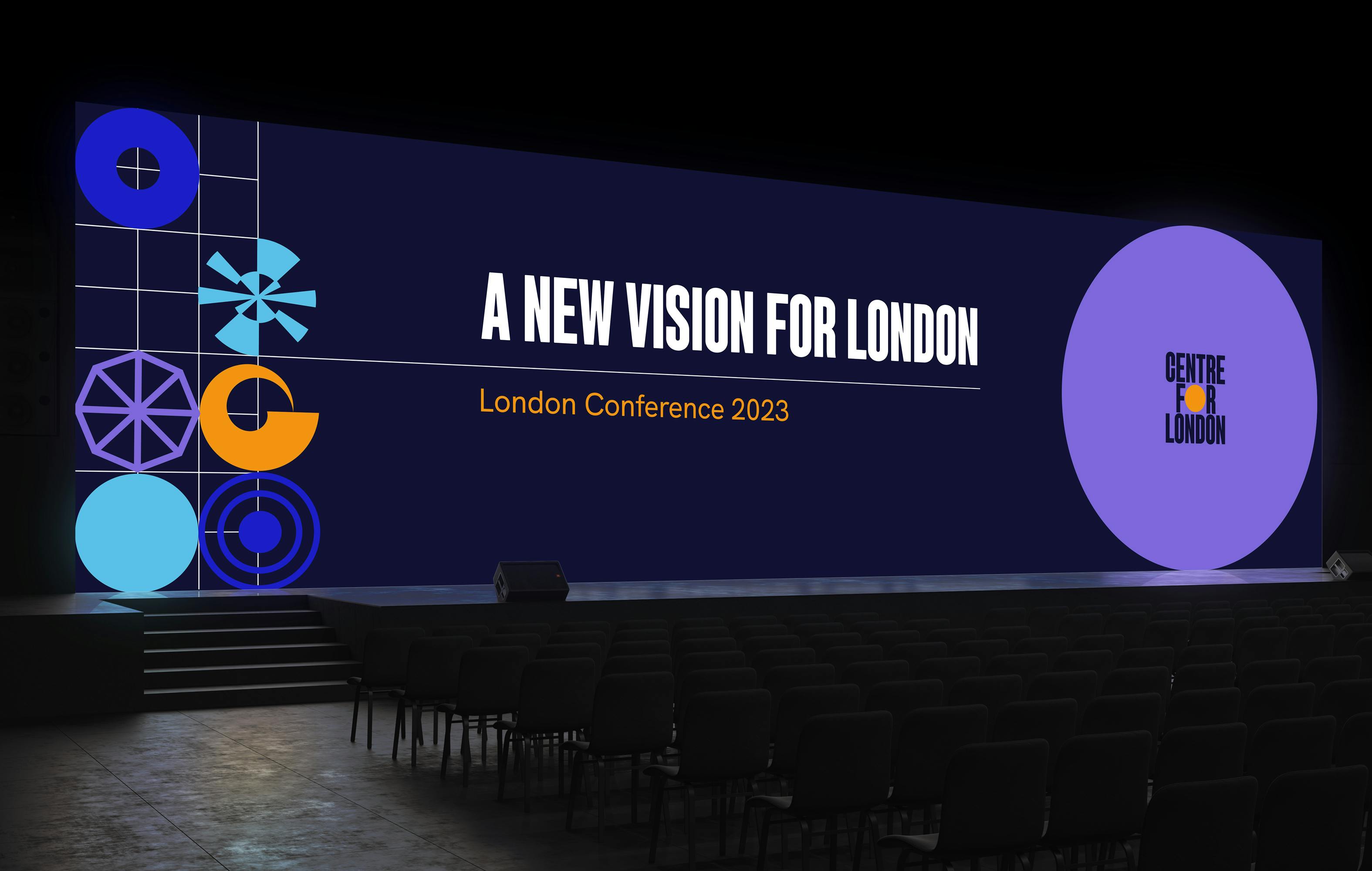
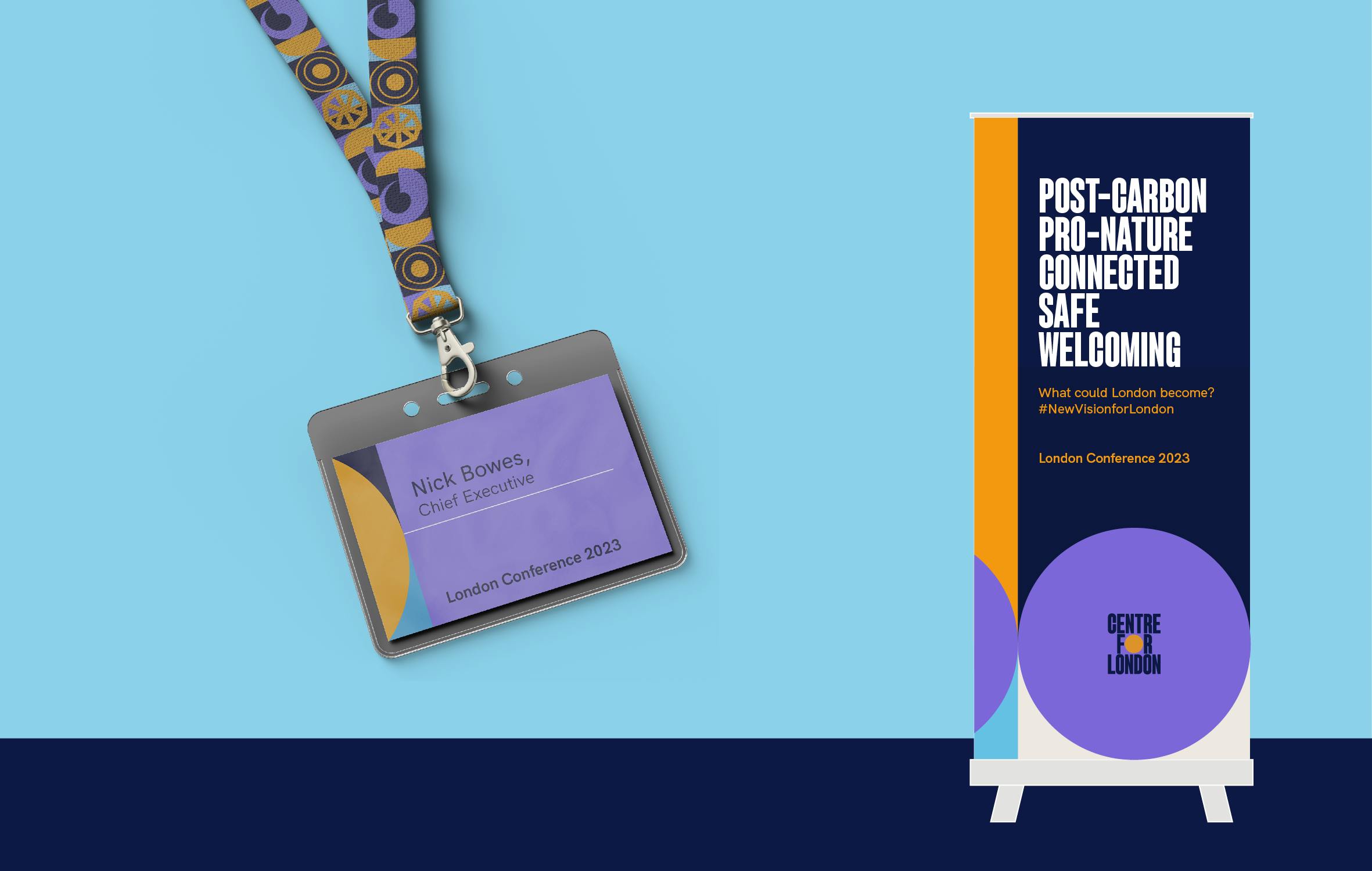
A crucial element of Centre for London’s rebrand is a new dynamic logo. This sees the letter O in ‘for’ become a showpiece for illustrating the multifaceted nature of their work, and the range of policy issues they cover. By default applied in the logo as a circular dot that conveys the think tank as the centre of the capital, the dot is also an expressive space, which can change colour and shape depending on the context of the application.
I’m delighted with our new branding that is both professional and eye-catching and is designed to speak to and on behalf of the entire city. With this, the Centre for London offers a refreshed visual identity that will support our work to make the city a better place to live, work and visit.
NICK BOWES, Chief Executive at Centre for London
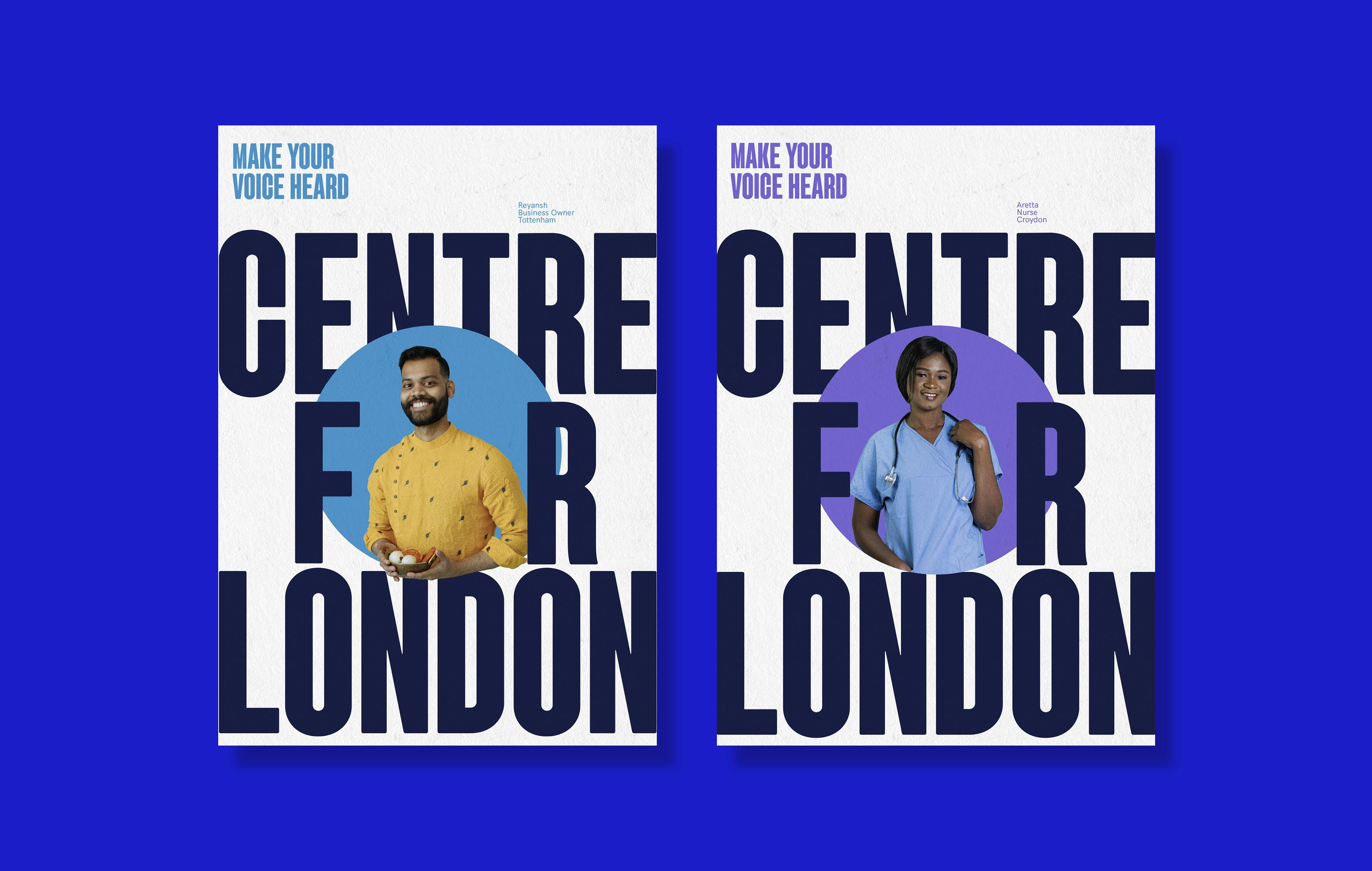
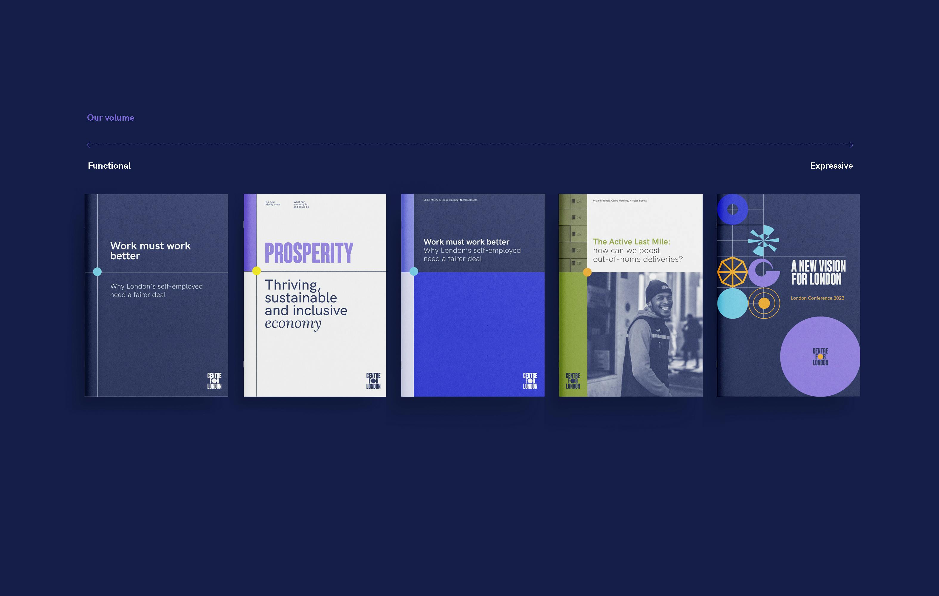
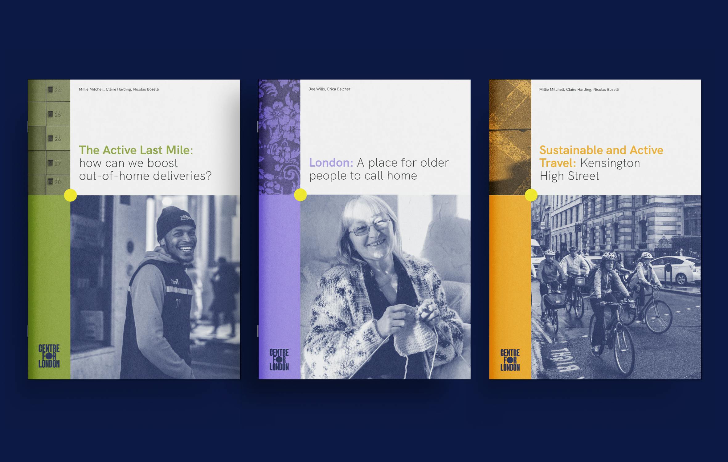
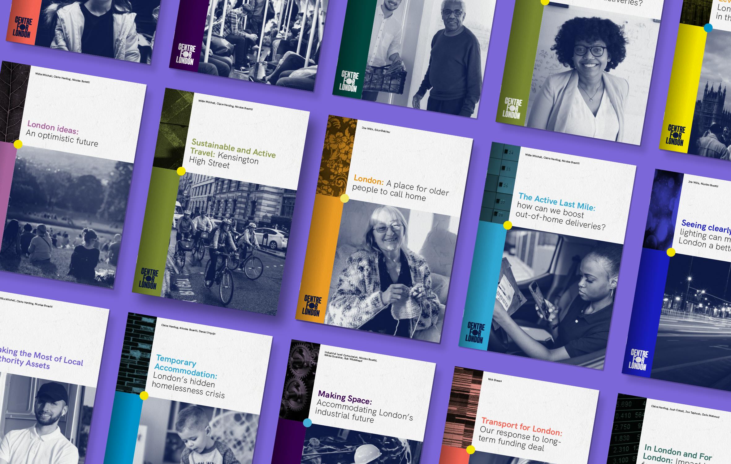
The identity system allows its visual volume to be adjusted from bold, graphic functional documents to expressive visuals that lead with photography, showcasing people at the heart of London’s issues. Topics are brought further alive by using textures, close-up patterns taken from the city’s streets, infrastructure and homes, adding detail and narrative to its communications.

As well as in its presentation to external audiences, Centre for London’s redesign also stressed the importance of participation and inclusion from an internal perspective. This was achieved via a hybrid model of working in which I mentored and collaborated with the think tank’s own in-house Senior Designer, Klara Blazek. While involving the in-house designer from concept creation to implementation is atypical within the design industry, the successful partnership highlights the merits of the approach for both sides.
Offering greater branding involvement to an internal designer had an upskilling effect in providing additional skills and experience that would not have been possible ordinarily. Furthermore, it strengthened the organisational ownership of the end product, providing greater assurance that the brand can live on in future as originally conceived, with the input of a staff member responsible for its practical application in day-to-day usage.
I am grateful that as an in-house designer, I had the opportunity to be involved in the full rebranding process, starting from conceptual ideation. I felt valued in every phase and provided Emmi with extra insight about what Centre for London’s needs were and how the brand would ultimately function. This allowed us to create a visual identity that would not falter when practically applied. Because of Emmi’s mentorship and assurance that my ideas would be incorporated, I am confident in the brand and my ability to successfully work with it in the future.
KLARA BLAZEK, Senior Designer at Centre for London